最近由于冬奥会的召开,吉祥物冰墩墩瞬间成了大家关注的焦点,网上甚至将价格炒到了2000元以上,那么作为一名程序员,我们既然买不起冰墩墩,那么就跟我一起利用代码来换画一个冰墩墩吧!
先看效果图
这里采用的都是web前端的基础技术,html与css感兴趣的,可以跟着我一步一步来完成。
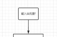
第一步:打开编辑器,新建一个网页文件
注意网页文件的后缀名是html,编辑器采用的vscode编辑器,当然大家也可以用记事本编写,然后注意将后缀txt,改为html即可。
第二步:书写网页基本骨架结构
网页的基本骨架部分,使用编辑器的同学可以直接输入!,然后按一下tab键自动生成,如果是记事本就需要手打了,大家注意标签的缩进。
第三步:书写冰墩墩的结构<body>
<div class="m_body"></div>
<div class="ear_left"></div>
<div class="ear_right"></div>
<div class="eye_left"></div>
<div class="eye_right"></div>
<div class="face c_blue"></div>
<div class="face c_red"></div>
<div class="face c_purple"></div>
<div class="face c_yellow"></div>
<div class="face c_green"></div>
<div class="nose"></div>
<div class="mouse"></div>
<div class="arm_left"></div>
<div class="arm_right"></div>
<div class="leg_left"></div>
<div class="leg_right"></div>
</body>
为了方便大家使用,咱们直接粘贴代码即可。每一个div块,都是冰墩墩的一个组成部分。有不懂的可以在下方留言。
第四步:编写冰墩墩样式<head>
<meta charset="UTF-8">
<meta http-equiv="X-UA-Compatible" content="IE=edge">
<meta name="viewport" content="width=device-width, initial-scale=1.0">
<title>冰墩墩</title>
<style>
* {
margin: 0;
padding: 0
}
body {
background: pink;
color: #000;
}
.m_body{
width: 362px;
height: 410px;
border: #393939 8px solid;
margin: 50px auto;
border-radius: 88% 88% 62% 68% / 82% 82% 95% 84%;
position: absolute;
left: 109px;
top: -30px;
background: #fff;
}
.ear_left, .ear_right {
background: #393939;
width: 81px;
height: 115px;
border-radius: 50%;
position: absolute;
z-index: -1;
}
.ear_left {
left: 150px;
top: 26px;
transform: rotate( -10deg );
}
.ear_right {
left: 362px;
top: 28px;
transform: rotate(10deg);
}
.eye_left, .eye_right {
background: #393939;
width: 83px;
height: 115px;
border-radius: 50%;
position: absolute;
}
.eye_left {
left: 185px;
top: 122px;
transform: rotate(45deg);
}
.eye_right {
left: 329px;
top: 122px;
transform: rotate(-45deg);
}
.eye_left:before, .eye_right:before {
content: "";
width: 40px;
height: 40px;
border: #fff 5px solid;
border-radius: 100%;
position: absolute;
}
.eye_left:before {
right: 10px;
top: 22px;
}
.eye_right:before {
left: 10px;
top: 22px;
}
.eye_left:after, .eye_right:after {
content: "";
width: 10px;
height: 10px;
background: #9b9b9b;
border-radius: 100%;
position: absolute;
}
.eye_left:after {
right: 27px;
top: 31px;
}
.eye_right:after {
left: 41px;
top: 44px;
}
.face {
position: absolute;
border-radius: 48% 48% 44% 49%/ 53% 54% 45% 47%;
}
.c_blue {
border: #6bcdf3 5px solid;
width: 280px;
height: 224px;
left: 150px;
top: 78px;
}
.c_red {
border: #af2350 5px solid;
width: 287px;
height: 233px;
left: 146px;
top: 73px;
}
.c_purple {
border: #5d75b3 5px solid;
width: 295px;
height: 240px;
left: 142px;
top: 70px;
}
.c_yellow {
border: #ffc346 5px solid;
width: 305px;
height: 248px;
left: 137px;
top: 65px;
}
.c_green {
border: #7fcb58 5px solid;
width: 313px;
height: 256px;
left: 133px;
top: 61px;
}
.arm_left, .arm_right {
background: #333;
position: absolute;
z-index: -1;
}
.arm_left {
width: 75px;
height: 118px;
left: 64px;
top: 244px;
transform: rotate(45deg);
border-radius: 24% 69% 68% 76%/ 53% 95% 40% 52%;
}
.arm_right {
width: 75px;
height: 148px;
left: 463px;
top: 162px;
transform: rotate(37deg);
border-radius: 56% 62% 98% 6%/ 40% 46% 80% 58%;
}
.arm_right:before {
content: "";
width: 16px;
height: 24px;
background: #bc242c;
position: absolute;
border-top-left-radius: 50%;
border-top-right-radius: 50%;
transform: rotate(45deg);
left: 32px;
top: 20px;
}
.arm_right:after {
content: "";
width: 16px;
height: 24px;
background: #bc242c;
position: absolute;
border-top-left-radius: 50%;
border-top-right-radius: 50%;
transform: rotate(-45deg);
left: 26px;
top: 20px;
}
.arm_c {
content: "";
width: 16px;
height: 24px;
position: absolute;
left: 426px;
top: 20px;
}
.nose {
background-color: #333333;
}
.nose:before, .nose:after {
content: '';
position: absolute;
background-color: inherit;
}
.nose, .nose:before, .nose:after {
width: 28px;
height: 18px;
border-radius: 42px 42px 60px 61px/ 30px 30px 50px 46px;
}
.nose {
position: absolute;
left: 284px;
top: 187px;
}
.mouse {
position: absolute;
left: 265px;
top: 205px;
width: 68px;
height: 25px;
border-radius: 48%;
border: #393939 7px solid;
border-top: none;
border-left: 0;
border-right: 0;
}
.leg_left, .leg_right {
background: #333;
position: absolute;
width: 83px;
height: 80px;
border-radius: 0 0 30px 30px;
z-index: -1;
}
.leg_left {
left: 187px;
top: 423px;
}
.leg_right {
left: 328px;
top: 423px;
}
.leg_left:after, .leg_right:after {
content: "";
width: 43px;
height: 30px;
position: absolute;
background: #363636;
border-radius: 30px;
}
.leg_left:after {
bottom: 0;
right: -3px;
}
.leg_right:after {
bottom: 0;
left: -3px;
}
</style>
</head>
大家注意编写的位置,将style标签放入head标签内部,然后复制对应的样式代码,大家有问题的话,可以下方留言。
这样我们的冰墩墩就绘制完成了,咱们只需要打开网页文件就可以看到咱们的成果,冰墩墩了,大家一起动手试一试吧!