Yi said that the school district (54) SPSS statistical analysis (64) used the old dialog box to create a graph-line chart

“分享兴趣,传播快乐,增长见闻,留下美好!大家好,这里是小编。欢迎大家继续访问学苑内容,我们将竭诚为您带来更多更好的内容分享。
"Share interests, spread happiness, increase knowledge and leave beauty! Hello everyone, this is Xiaobian. Welcome to continue to visit the content of the academy, and we will bring you more and better content sharing wholeheartedly.
【思维导图】

【基础知识】
折线图(Line Charts)是用线条的上下波动的形式,来反映连续性的相对资料的变化趋势。它主要用于表示现象在时间上的变化趋势、现象的分配情况和两个现象之间的依存关系等。
Line Charts is the form of fluctuation of lines to reflect the continuous change trend of relative data. It is mainly used to express the change trend of phenomena in time, the distribution of phenomena and the dependence between two phenomena.
折线图的类型,选择“图形->旧对话框->折线图”,在该对话框中定义了线图的三种类型:简单折线图(Simple Line Chart)——用一条折线表示某个现象的变化趋势;多线折线图(Multiple Line Chart)——用多条折线同时表示多种现象的变化趋势;垂直折线图(Vertical Line Chart)——反映某些现象在同一时期内差距的统计图。
For the type of line chart, select "Graphic-> Old Dialog Box-> Line Chart", and define three types of line charts in this dialog box: Simple Line Chart-use a line to represent the changing trend of a certain phenomenon; Multiple Line Chart-using multiple broken lines to express the changing trend of various phenomena at the same time; Vertical Line Chart-A statistical chart reflecting the difference between certain phenomena in the same period.
与条形图相似,除了选择线图的类型外,还要选择对话框的“图表中的数据为”选项组中的折线图的模式,具体含义与条形图的三种分类相同。
Similar to bar charts, in addition to selecting the type of line chart, you should also select the mode of line chart in the "Data in Chart Is" option group of the dialog box, which means the same as the three categories of bar charts.
【实例分析】
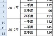
折线图的生成,下来下面我们来看一个实例,下表是在几年间统计的邮电业务基本情况的部分数据,试绘制每种业务在这几年中发展情况的折线,以比较每种业务在这几年中的变化。(数据来源,中国统计摘要2008)
The generation of line chart, let's look at an example below. The following table is some data of the basic situation of post and telecommunications business in several years. Try to draw a line of the development of each business in these years to compare the changes of each business in these years. (Source, China Statistical Abstract 2008)

第1步,数据组织,根据上表的统计数据建立数据文件,定义三个变量名:指标分类、年份、指标值。整理后的SPSS数据文件如图所示。
Step 1, data organization, according to the statistical data in the above table, establish a data file, and define three variable names: index classification, year and index value. The collated SPSS data file is shown in the figure.